
Designing a Scripture explanation tool that earns trust before it gives answers
Role
UX/UI Designer — end-to-end: research, IA, branding, interaction, visual design, testing
Type
End-to-End capstone · self-directed independent brief
Timeline
5 weeks (August–September 2026)
Platform
iOS mobile app
Tools
Figma, FigJam, Canva
Prototype
Overview
Biblenook is a mobile app that explains Bible verses at a depth the reader chooses, and shows exactly where every explanation comes from.
People already ask AI to explain Scripture and five of the six people I interviewed were doing it before I designed anything. But they do it with a specific discomfort: general AI pulls from broad, unvetted sources and can't tell you what it's drawing from. In a domain where being wrong has spiritual weight, that's a real problem.
I designed Biblenook around two ideas the research made unavoidable: explanations should adapt to the reader's depth, and every answer should name its source.
The Problem
Existing tools split into two camps and neither helps someone who is confused mid-verse. YouVersion owns daily Bible reading with over a billion installs, but offers no answer to "I read this and don't understand it." Logos proves people will pay for sourced, credible depth then gates it behind a steep learning curve and pricing up to five figures.
The AI Bible apps that do attempt explanation have their own problems. Biblia.chat validates the depth-toggle idea but dilutes it with games, audio, and devotionals. Haven has 1M+ users and a paywall its own reviewers describe in ethical terms and teenagers openly upset that spiritual guidance sits behind $7/week.

How might I help already-engaged Bible readers understand what they're reading, at their own depth, with sourcing they can actually verify?
The Research
Six in-depth interviews with regular Bible readers, ranging from a returning believer rebuilding her faith as an adult to a Seventh-Day Adventist who reads daily with a Tony Evans study Bible at his side.
-
All six already read daily or near-daily. The job wasn't building a habit, it was helping engaged readers go deeper.
-
Every participant, unprompted, wanted to know where an explanation came from. Taylor's litmus test: "where does it say that in the Bible?", a question she applies even to her own mother.
-
Two participants independently named Tony Evans as their default commentary source. A credentialed human name does work no AI answer can.
-
Five of six used AI for Bible questions. But multiple participants drew a hard line between explaining the text and telling them what to do with their lives. Temitayo on asking AI about obedience: "that's dead."
-
Every participant agreed. Temitayo cited Mark 10 as a passage where oversimplifying for a new believer is actively harmful.
-
Nobody wanted recurring billing. Two ruled it out outright; one wouldn't pay at all while free AI exists.
Six findings shaped the entire product:
Defining the Project
-
Five of six used AI for Bible questions. But multiple participants drew a hard line between explaining the text and telling them what to do with their lives. Temitayo on asking AI about obedience: "that's dead."
-
Every participant agreed. Temitayo cited Mark 10 as a passage where oversimplifying for a new believer is actively harmful.
-
Nobody wanted recurring billing. Two ruled it out outright; one wouldn't pay at all while free AI exists.
Two personas, two different trust models
The interviews split cleanly. Jasmine is a returning believer reading daily through shared plans, cautious about AI, who needs plain-language explanation without being made to feel behind. Jonathan is a Bible study leader and heavy AI user who trusts nothing that can't name its sources and won't tolerate friction in a habit he's already built.
That split set the product's central tension: one reader needs the explanation simplified, the other needs it substantiated — and both must be served without building two apps.
Jasmine needs a guided, plain-language way to understand what she's reading and why it matters, because without foundational structure she feels behind other believers. That’s a gap current apps, built for either total beginners or fluent experts, don't address.
Jonathan needs fast, citation-backed explanations inside the app he already reads in, because he won't trust, or pay for, a tool that can't show its sources or adds friction to an established habit.
The market gap: no existing product combines adjustable explanation depth with verifiable, trustworthy sourcing in one focused experience.

The overlap is unusually clean. Visible sourcing is simultaneously the trust mechanism users demanded and the clearest differentiator from Biblia.chat, Haven, and general AI chat. A focused, uncluttered product is what both personas asked for and what keeps build cost down. And a one-time purchase answers the anti-subscription sentiment while keeping the business honest with the same users it's asking to trust it.

Sitemap. This was created to organize the app around one principle: the two entry points to an explanation are equals, not a primary and a fallback. Ask & Explore is the destination path for someone with a question; the Bible reader's tap-to-explain is the in-context path for someone who hits a confusing verse mid-read. Both resolve to the same Answer Screen, where the in-answer detail views (Source Citations, Source Profile, Translation Comparison, Related Testimony) branch off as verification layers rather than separate destinations.
I also marked Phase 2 items (denominational preference) as explicitly out of v1 rather than leaving scope ambiguous.

Both flows use standard notation: ovals for start and end, rectangles for process steps, diamonds for decisions, solid lines for the happy path and dashed for alternates. Two decisions in Flow 1 matter most. The depth selector sits inside the answer loop, so a reader can re-pitch an explanation without re-asking the question. And there's a deliberate branch for when no verifiable source exists. The app says so rather than fabricating one. Designing the failure state was a direct response to the research: a tool claiming sourcing has to be honest about the moment it doesn't have any.
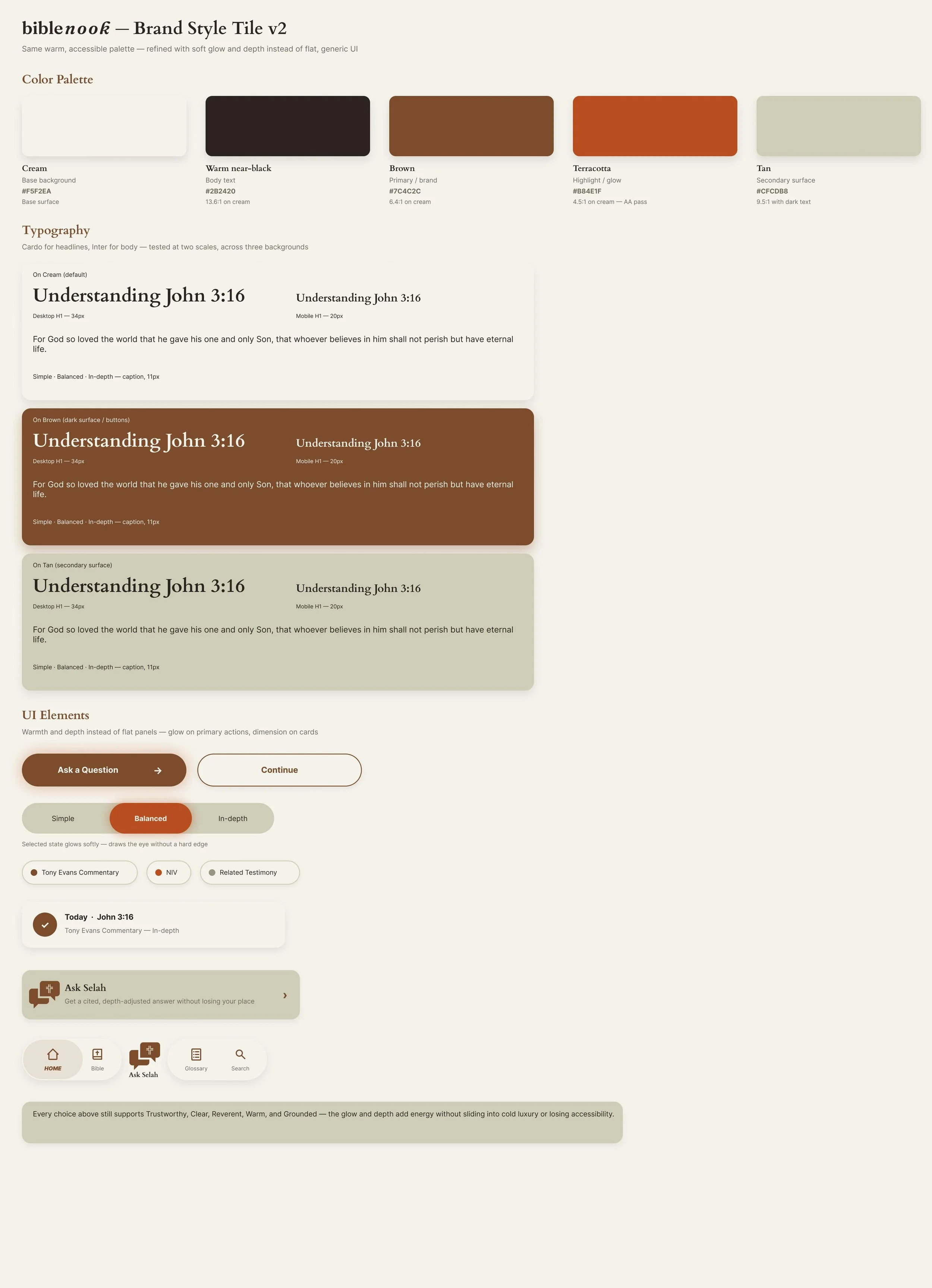
The name came first: a nook is a small, quiet place you return to. The brand had to feel like that, warm and unintimidating, while still reading as credible enough for someone checking citations.
The palette is cream, warm near-black, brown, terracotta, and tan, with every pairing verified for WCAG AA contrast. Cardo for headlines gives the warmth and slight editorial weight of a printed study Bible; Inter keeps body text and long explanations clean at small sizes.
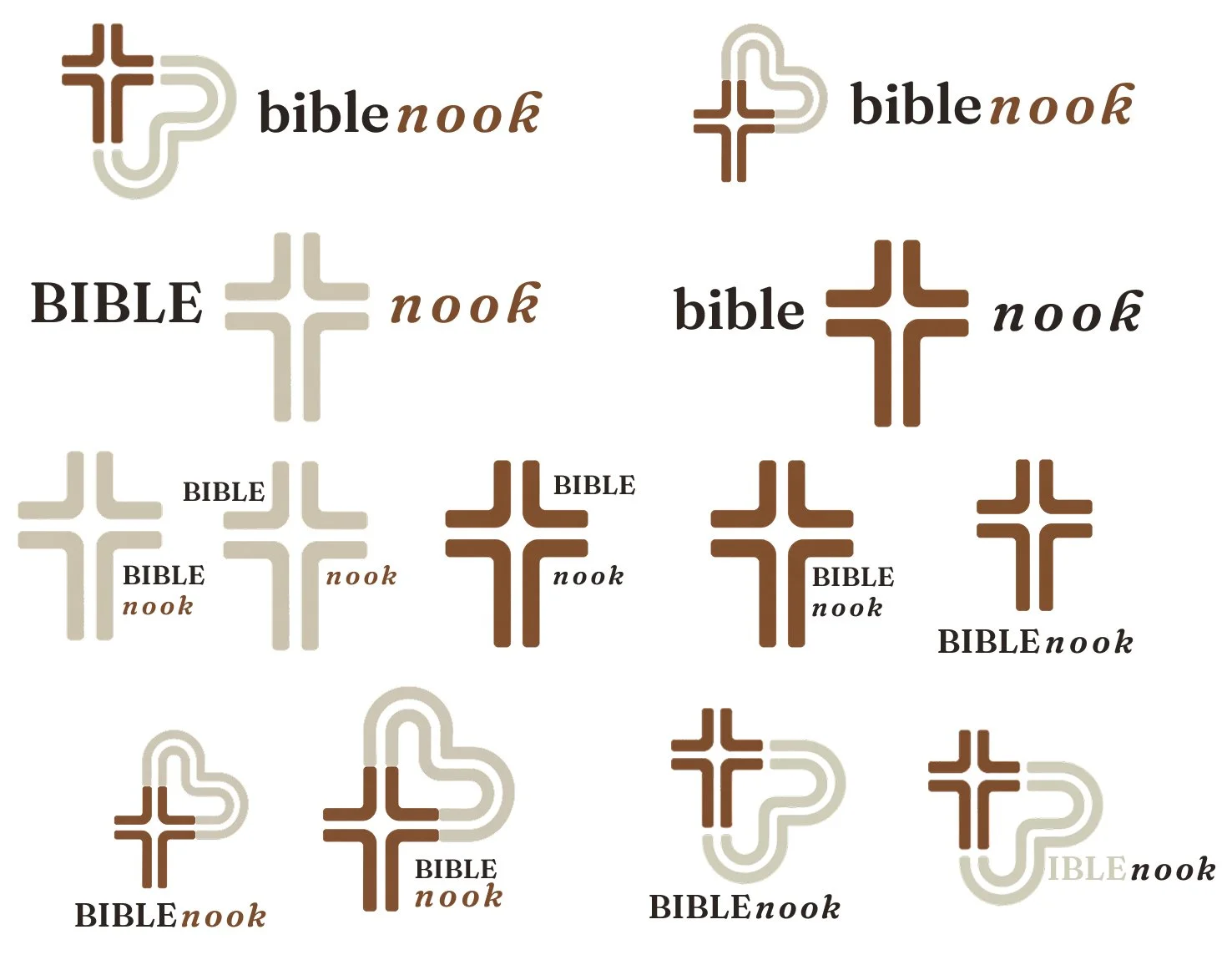
The logo pairs a brown cross with a tan loop that does triple duty: it reads as a heart, as the "b" in bible, and as the silhouette of a seating nook, the kind of tucked-away seat you settle into to read. Faith, warmth, and the name itself, all in one mark, and it holds at app-icon size.
The rule I held throughout: warmth without gimmicks. The research audience actively disliked gamified, feature-stacked faith apps, so there are no mascots or unlockable rewards, just a palette and voice that feel like a quiet room.
Design


Because the app is a system rather than a set of screens, I built a component library on a 4-column mobile grid with 20px margins and an 8pt spacing system: buttons, inputs, the chat bar, navigation, cards, the Selah findings block, and the source rows. Every color and type pairing is WCAG AA verified.


Flow 1


Flow 2
-
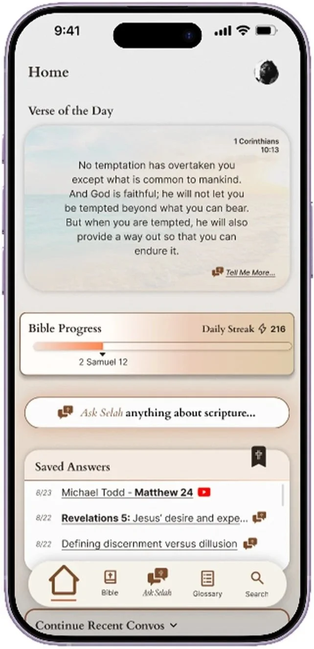
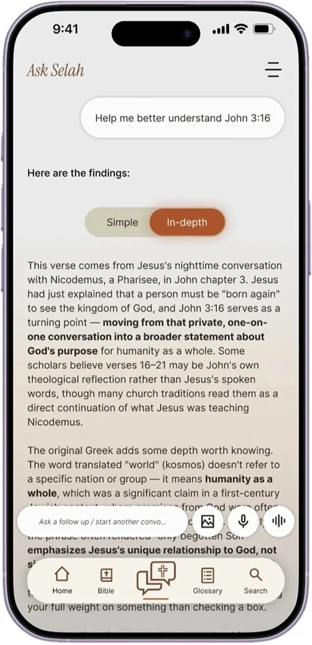
Depth is a one-tap switch on the answer itself, not a setting buried in onboarding. It ships as two options rather than three as the lo-fi testing showed "Balanced" made the choice harder, not more precise.
-
Every explanation carries source rows with real, recognizable names and platform links — Tony Evans commentary, a Tim Tebow testimony — plus an expandable "See additional sources" tray. Sources save individually, so a reader keeps the commentary that helped rather than an entire conversation.
-
Ask Selah for a question you arrive with; tap-a-verse Explain for a question that finds you mid-reading.
Iterations


Flow 1


Flow 2
-
the highest-leverage fix, converging three participants' separate suggestions, and the direct answer to the search-habit finding
-
adds motion and familiarity, answering the "too text-heavy" note with function rather than decoration
-
reduces Home clutter without losing the content
-
so chat history works the way messaging apps have already taught people to expect
-
platform logos only, no redundant play buttons, and enlarged icons that tested as too small
Outcome & Reflection
A complete End-to-End product: research through brand system, component library, and an interactive prototype covering both explanation flows. Validated across two testing rounds with the same six readers, so every change could be measured against the same people.
What I learned: in a trust-sensitive domain, the interface's job is to show its work. Named sources, visible citations, and an honest "no verifiable source" state did more for credibility than any visual polish and testing confirmed it: recognizable names produced automatic trust, while the absence of sourcing is exactly what makes people distrust general AI.
The harder lesson was the search-habit finding. I designed a strong differentiator and half my users walked right past it, because existing habits beat new features unless the interface actively invites the change. Good design isn't only making a feature work, it's making people notice it exists.
Next steps: build the first-run guidance requested across two rounds, test the Home prompt against the search-habit behavior it's meant to fix, and validate the one-time purchase model with the participants who ruled out subscriptions.
-
All six already read daily or near-daily. The job wasn't building a habit, it was helping engaged readers go deeper.
-
Every participant, unprompted, wanted to know where an explanation came from. Taylor's litmus test: "where does it say that in the Bible?", a question she applies even to her own mother.
-
Two participants independently named Tony Evans as their default commentary source. A credentialed human name does work no AI answer can.
-
the highest-leverage fix, converging three participants' separate suggestions, and the direct answer to the search-habit finding
-
adds motion and familiarity, answering the "too text-heavy" note with function rather than decoration
-
platform logos only, no redundant play buttons, and enlarged icons that tested as too small
-
reduces Home clutter without losing the content
-
so chat history works the way messaging apps have already taught people to expect