
Designing a credible front door for a GIS-powered land feasibility platform
Overview
LandMatch is a pre-launch SaaS platform for land feasibility consultants which are experts who determine what can legally and practically be built on a parcel of land. Their research is fragmented across 10–20 sources per parcel: zoning codes, environmental constraints, infrastructure data, county records. The company already had a product and a live site, both built by its founding team of a licensed civil engineer and a technical cofounder. The engineering was strong. The site explaining it was written by people who already knew the answer, for people they assumed already knew the question.
LandMatch hired our three-person UI/UX team to design its brand, marketing website, and product. I owned the homepage and website experience — the public-facing entry point that had to explain a complex, technical product in seconds and route skeptical professionals into the app. One teammate led the GIS map + AI product interface; the other led branding and the style guide.
Team
3 designers + LandMatch client team
Role
UX/UI Designer — homepage & website experience
Tools
Figma, FigJam, Canva
Timeline
5 weeks (May–June 2026)
My focus
Marketing homepage, subpage template, marketing-to-product entry flow
Status
Live at landmatch.io
Challenge
Land feasibility is a high-stakes, jargon-heavy domain, and our audience (civil engineers and consultants) is deeply skeptical of AI products that overpromise. A generic startup landing page would fail on contact.
How might the homepage make LandMatch instantly understandable, prove it deserves professional trust, and move users into the product without friction?
Research
I worked from our team's shared research: a client kickoff, interviews with three civil engineers (including LandMatch's licensed engineer SME), an affinity map we built from ~80 observations, and a competitive teardown of Acres, ArchiWise, and Algoma. I also owned the workflow analysis — mapping how consultants actually move from "here's a parcel" to a go/no-go decision.

Three findings from the interviews shaped everything I designed:
-
Consultants dismissed tools that hide how conclusions are reached. Citations and local data depth were preconditions, not features.
-
The product's value isn't just green lights, it's ruling out bad parcels early. The homepage had to sell decision confidence, not dashboards.
-
No rival paired local data depth with transparent sourcing and that became the story my homepage needed to tell.

What the competition taught the homepage. Across four competitors, the same pattern repeated: every product was strong somewhere. Acres in parcel data, ArchiWise in zoning depth, Algoma in speed, TestFit in guided visual workflow but each failed the same user in the same way. They were either too technical for non-experts, too "black box" to trust, or too focused on raw output to guide a decision. No one paired real analytical depth with accessibility and transparent reasoning.
For my portion of the project, that gap wasn't just a product opportunity, it was a messaging one. If overwhelm and opacity were the market's failure modes, LandMatch's homepage had to be the visible counterargument: plain-language value proposition instead of jargon, a guided five-step workflow instead of a feature dump, and trust signals (sources, engineer credibility, transparent reasoning) surfaced before any marketing claims. The competitive analysis effectively wrote the homepage's job description: prove, in the first scroll, that this product is the one that doesn't overwhelm you.
Design

I structured the homepage as a persuasion sequence answering three questions in the order a skeptical visitor asks them:
1. What is this? → Hero: plain-language value proposition + real product preview
2. Why should I trust it? → Credibility band: engineer-built, source-backed, transparent AI
3. How does it work? → The 5-step feasibility workflow, straight from my workflow analysis: Select Site → Gather Data → Analyze Constraints → Generate Feasibility → Review Recommendation
Everything else (feature cards, persona-split sections for engineers vs. developers, social proof, final CTA) supports that spine. My guiding note from client feedback: "simplify" doesn't mean minimal; it means complex capability → simple understanding.
FINAL Solution
I designed desktop (1440) and mobile versions through multiple rounds of team and client critique.
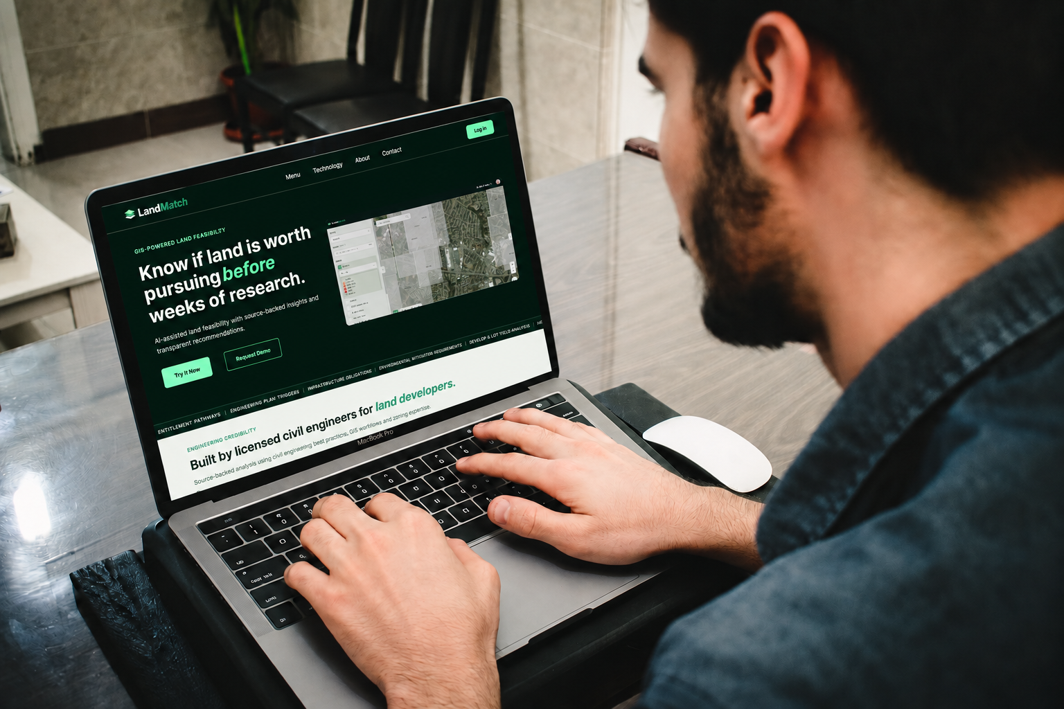
Hero. Headline written to lead with the user's payoff, "Know if land is worth pursuing before weeks of research", paired with a product walkthrough preview so the promise stays concrete, not abstract.
Trust band. Short, scannable proof points (GIS workflows, source-backed analysis, engineer-reviewed reasoning) placed before any feature marketing, because research said skepticism arrives first.
Persona split. Side-by-side paths for Civil Engineers & Consultants vs. Developers & Acquisition Teams — the two audiences my persona work showed reason differently about the same product.
A real design debate: the primary CTA. I proposed Try It Now as primary with Request Demo secondary; a teammate pushed back for demo-first. We took it to the evidence: a self-serve product entry matched the client's goal of low-friction adoption and our users' preference to evaluate tools hands-on before talking to sales. Try It Now won and testing later validated the choice.
Subpage template. To keep the site scalable, I designed one reusable shell (Hero → Overview → Core Content → Supporting Modules → CTA) that powers About, Technology, and Features pages without redesign.
Consultants use LandMatch on desktops, but they discover it on phones so mobile got a re-prioritized hierarchy, not a shrunken layout: value proposition and full-width CTAs first, walkthrough video immediately after, workflow steps rotated vertical to follow the scroll. Understand, trust, tap, all in one thumb-length.
The site I inherited opened with "Read the codes that govern your parcel." Accurate, precise, and written from inside the machine. My job wasn't to make it prettier, it was to re-sequence it around a stranger's questions.
The headline is the clearest example. "Read the codes that govern your parcel" describes what the system does. "Know if land is worth pursuing before weeks of research" describes what the user gets back, which research showed is what consultants are actually shopping for: a confident go/no-go, where a fast and well-sourced no counts as a win. I also put a product walkthrough in the hero, because the old page asked a skeptical expert audience to take the claim entirely on faith.
The technical depth didn't go anywhere. It just stopped being the first thing you had to get through.
The same shift shows up in the workflow section. The old site described three steps the software takes. I replaced it with the five-step sequence from my workflow analysis, Select Site, Gather Data, Analyze Constraints, Generate Feasibility, Review Recommendation, built from interviews with three practicing civil engineers. It maps to how they reason through a parcel, not how the engine runs.
— Two more changes followed the same logic —
-
90 words of prose on the old site → became five cards you can read in six seconds with every claim intact
-
Addressed five audiences in paragraphs with no action attached to any of them → became two routed paths with their own calls to action
Testing & Iteration
The team ran moderated usability tests with practicing civil engineers across the website, onboarding, and product. For my surface, the signal that mattered: testers described the website as clear and the onboarding entry as frictionless. They could articulate what LandMatch does, who it's for, and what to do next without prompting.
Testing also sharpened the work: I refined messaging hierarchy and strengthened trust signals so the marketing site set accurate expectations for the product behind it.
Outcome
A build-ready homepage and subpage system, delivered with a final client handoff presentation
The site is live at landmatch.io and the client has continued evolving the copy on the foundation we delivered, which is exactly what a good design system should enable
Validation from the hardest audience possible: skeptical domain experts who recognized their own workflow in the page
Reflection
Working as a team. This project was my first experience with true creative interdependence. Three designers with separate ownership areas (branding, product, my homepage) whose work had to resolve into one coherent system. It meant learning something new: taking live pushback. Critique happened in real time (like our primary-CTA debate) and the rule we settled into was that ownership earned you the final call, but every objection earned a real answer first.
The deeper lesson was that the tiebreaker was never us. Every "I think it should…" had to survive "what did users actually tell us?" Our instincts were hypotheses until research backed them, and some of my favorite ideas didn't survive that test. What shipped traced back to evidence: an interview quote, a competitive gap, a usability finding. The client's handoff feedback confirmed the result — brand, website, and product reading as one system. Advocating for the user's evidence, not defending my design, is what I carry forward.
What this project taught me: designing for trust is an information-architecture problem before it's a visual one. The homepage succeeded when it made a technical product feel approachable without feeling simplified. Clarity and credibility had to rise together.
What I'd do next: test messaging with developer-side audiences (we validated mostly with engineers), replace placeholder social proof with real artifacts like sample feasibility reports, and tighten the marketing-to-onboarding bridge with motion and microcopy.